
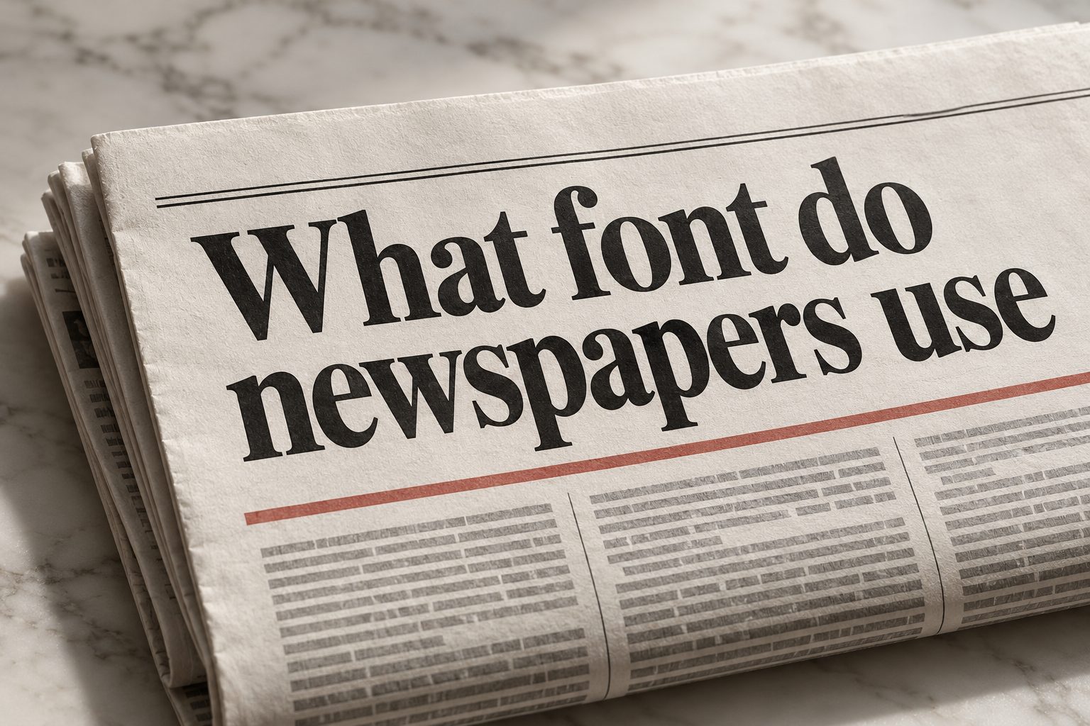
Newspapers have used distinctive typefaces for centuries, but the answer to “what font do newspapers use” is not limited to one universal choice. Traditional newspapers often rely on serif fonts because the small finishing strokes help guide the eye across dense columns of text. Common examples include Times New Roman, Georgia, Garamond, Baskerville, and custom newspaper typefaces based on these classic styles. Modern publications may combine serif fonts for articles with sans-serif fonts for headlines, captions, menus, and digital interfaces. The best newspaper font depends on readability, printing conditions, available space, brand identity, and whether the content appears on paper or a screen. This guide explains the most common newspaper fonts, why they work, how newspapers pair typefaces, what designers consider during production, and how you can choose a similar style for your own publication, newsletter, website, school paper, or editorial project.
Why Newspapers Use Serif Fonts
Serif fonts are strongly associated with newspapers because they have a long history in editorial printing. Their small decorative strokes can create a visual line that helps readers move through tightly packed text. However, readability is only one reason newspapers favor them.
1. Serifs Help Guide The Eye
Serifs create subtle horizontal movement along a line of text. In a newspaper column, where sentences may be narrow and closely spaced, these strokes can help readers follow words from left to right. The effect is not dramatic, but over many paragraphs it can make reading feel more natural and controlled.
2. Serif Fonts Feel Established
Newspapers often communicate authority, accuracy, and tradition. Serif typefaces support that impression because they are connected with books, formal publishing, historical documents, and long-established news organizations. A classic serif font can make an article feel serious before the reader has even finished the headline.
3. Serif Fonts Work Well In Columns
Newspapers usually arrange stories in narrow columns rather than wide blocks. Serif letterforms remain recognizable when words are displayed in compact lines. Their varied shapes also create texture, helping a dense page look organized instead of appearing like a gray wall of identical characters.
4. They Support Long-Form Reading
News articles, opinion pieces, investigations, and features often require sustained attention. Serif fonts are commonly chosen for this kind of content because they produce a traditional reading experience. The right font, size, spacing, and contrast work together to reduce visual fatigue during longer sessions.
5. They Have Strong Print History
Many serif fonts were designed for metal type, books, and early printing systems. Newspaper typography developed from those traditions, so serif styles became part of the visual language of journalism. Even when digital tools replaced older presses, the familiar appearance remained valuable to publishers.
6. They Communicate Editorial Seriousness
A sans-serif font can feel modern, direct, or informal, while a serif font often appears more measured and authoritative. Newspapers use this difference intentionally. The typeface helps establish the tone of a publication, especially when the story involves politics, business, public affairs, or investigative reporting.
Popular Fonts Used By Newspapers
There is no single font used by every newspaper. Publications select typefaces based on their editorial identity, production system, audience, and available space. Some use widely available fonts, while others commission custom families designed specifically for their pages.
1. Times New Roman
Times New Roman is one of the most recognizable newspaper-style fonts. It was designed for newspaper printing and became widely used because it is compact, familiar, and efficient. Although many modern newspapers have moved to custom alternatives, Times New Roman remains a useful reference when people want a traditional editorial appearance.
2. Georgia
Georgia was designed for screen readability, but its sturdy serifs and generous proportions also make it suitable for newspaper-inspired layouts. It appears warmer and more open than Times New Roman, which can help articles feel accessible. Georgia is particularly useful for websites, newsletters, and digital publications.
3. Garamond
Garamond refers to a group of old-style serif typefaces influenced by sixteenth-century printing. These fonts have elegant shapes, moderate contrast, and a literary character. Garamond can give a newspaper or magazine a refined appearance, although some versions may become difficult to read when printed very small.
4. Baskerville
Baskerville has a polished transitional serif design with clear contrast between thick and thin strokes. It looks formal without feeling overly decorative. Newspapers, magazines, and editorial brands may use Baskerville when they want to suggest credibility, sophistication, and careful craftsmanship.
5. Charter
Charter was designed to remain readable under difficult printing conditions. Its strong shapes and economical proportions make it a practical choice for editorial text. A Charter-style font can work well when a publication needs a serious serif that stays clear at smaller sizes.
6. Utopia
Utopia is a flexible serif typeface often associated with professional publishing. It offers a balanced combination of readability and visual personality. Its proportions allow articles to fit efficiently while maintaining a polished appearance, making it suitable for newspapers, reports, and long-form editorial layouts.
7. Custom Newspaper Typefaces
Large publications frequently use custom fonts rather than relying on common desktop choices. A custom family may include several widths, weights, and optical sizes. This allows designers to fit more words into a column, create distinctive headlines, and maintain consistent branding across print, websites, mobile applications, and social media.
How Newspaper Fonts Differ From Regular Fonts
A newspaper typeface must handle demanding conditions that do not affect every design project. It may be printed on absorbent paper, used at small sizes, placed in narrow columns, or displayed beside several competing headlines. These requirements influence the design of the letters.
1. Newspaper Fonts Are Often Space Efficient
Newspapers need to fit a large amount of information onto each page. Typefaces may use relatively narrow characters and carefully controlled spacing so that articles occupy less room. Space efficiency helps publishers include more stories without reducing the text size too far.
2. They Maintain Clarity At Small Sizes
A font intended for newspaper body copy must remain recognizable when printed in small type. Designers pay attention to open counters, distinct letterforms, sturdy serifs, and appropriate stroke thickness. These details prevent letters from filling in or becoming confusing during printing.
3. They Handle Imperfect Ink Spread
Newsprint is usually more absorbent than high-quality coated paper. Ink can spread slightly into the paper fibers, softening fine details. Newspaper typefaces often compensate with robust shapes and carefully designed strokes that remain legible after the printing process.
4. They Include Useful Width Variations
A comprehensive newspaper font family may include condensed, regular, and wide versions. Narrow styles help fit headlines into limited spaces, while regular styles support comfortable reading. Different widths give editors flexibility without forcing them to change the wording of a headline.
5. They Offer Many Weights
Newspaper layouts need light, regular, medium, semibold, bold, and black styles. These weights establish hierarchy between headlines, subheadings, captions, labels, and body text. A family with consistent weights makes the page feel unified while still allowing important information to stand out.
6. They Are Designed For Fast Scanning
Readers often scan a newspaper before choosing which story to read. Strong typefaces help separate sections, indicate importance, and make headlines understandable at a glance. Clear hierarchy is therefore just as important as the comfort of reading complete articles.
Fonts Used For Newspaper Headlines
Headlines do not always use the same font as article text. They must attract attention, communicate the main idea quickly, and fit within a specific area of the page. Newspapers may use serif, sans-serif, slab serif, or display fonts depending on the publication’s personality.
1. Bold Serif Headlines
Bold serif headlines create a traditional and authoritative appearance. They work particularly well for broadsheet publications, political reporting, business coverage, and major front-page stories. A strong serif headline can connect visually with the body text while providing enough weight to command attention.
2. Sans-Serif Headlines
Sans-serif headlines look clean, modern, and direct. Newspapers often use them for sports, technology, lifestyle, or digital-first content. Fonts such as Helvetica-style or Univers-style families provide a sharp contrast against serif article text and can make a page feel more contemporary.
3. Slab Serif Headlines
Slab serif fonts have thick, block-like serifs and strong visual presence. They can create a bold, confident personality, especially for feature sections, opinion pages, and promotional covers. Because slab serifs are visually heavy, designers usually balance them with simpler supporting typography.
4. Condensed Display Fonts
Condensed fonts allow a long headline to fit into a narrow column without reducing the size excessively. They are useful for breaking news, front-page banners, and multi-column layouts. However, excessive condensation can make words harder to read, so designers must preserve sufficient spacing.
5. Italic Headline Styles
Italic fonts can signal opinion, commentary, interviews, or special features. They should be used selectively because long italic headlines may reduce scanning speed. A restrained italic treatment can add variety without weakening the overall hierarchy of the page.
6. Mixed Headline Systems
Many newspapers use several headline treatments rather than one universal style. A main story may receive a large bold headline, a secondary story may use a smaller semibold heading, and a short brief may use an all-caps label. Consistency comes from the system, not from using only one font.
How Newspapers Pair Fonts
Font pairing gives a newspaper structure. The goal is to make every element feel related while ensuring that different content types are easy to distinguish. Successful pairing usually depends on contrast, hierarchy, and consistent spacing.
1. Serif Body Text With Sans-Serif Labels
This is one of the most common combinations. A readable serif handles articles, while a sans-serif font identifies sections, categories, navigation, or small labels. The contrast makes the page easier to scan without making it feel disconnected.
2. Serif Headlines With Matching Serif Text
Some newspapers use one extended serif family for nearly everything. Different weights and sizes create the hierarchy. This approach feels traditional and cohesive, especially when the typeface has enough flexibility for headlines, captions, and compact notes.
3. Sans-Serif Headlines With Serif Articles
This pairing feels more modern and is common in redesigns and digital publications. The sans-serif headline attracts attention with clean shapes, while the serif body font supports longer reading. The contrast also helps separate quick information from detailed reporting.
4. Different Fonts With Similar Proportions
Two fonts do not need to look identical, but they should have compatible proportions. If one font is very wide and another is extremely narrow, the page may feel unstable. Similar x-heights, balanced stroke weights, and comparable visual density usually create a smoother result.
5. Contrast Through Weight And Size
Font pairing is not only about choosing different families. A regular body font paired with a bold version of the same family may be enough. Designers also create contrast through size, capitalization, spacing, and placement, which can produce a more disciplined editorial style.
6. Limiting The Number Of Fonts
Using too many typefaces makes a newspaper look unorganized. Most professional publications rely on a controlled family system, sometimes supported by one contrasting family. Limiting choices helps readers recognize recurring patterns and allows the content, rather than the decoration, to lead.
Choosing A Newspaper Font For Your Project
You do not need a major publishing company’s custom type system to create a newspaper-style design. A careful choice from widely available fonts can produce a credible result for a newsletter, school publication, community paper, blog, or editorial website.
1. Decide Where The Text Will Appear
Print and digital screens have different requirements. A font that looks excellent on a high-resolution display may become weak on inexpensive paper. Identify the medium first, then test the typeface in the actual size and conditions where readers will encounter it.
2. Define The Publication’s Personality
Choose whether the project should feel traditional, modern, local, elegant, energetic, or serious. Garamond may suggest heritage and refinement, while Georgia can feel friendly and dependable. A sans-serif family may be more appropriate for a technology-focused or youth-oriented publication.
3. Test Body Text Before Headlines
Body copy is usually the most demanding typography in a newspaper. Print several paragraphs in narrow columns and check whether letters remain clear, lines feel comfortable, and the page avoids excessive darkness. If the body font fails, no headline treatment can fully repair the design.
4. Check Numerals And Punctuation
Newspapers contain dates, prices, percentages, quotations, abbreviations, and names. Examine the numerals, quotation marks, apostrophes, parentheses, and currency symbols carefully. A typeface may look attractive in alphabetic text but perform poorly when an article includes many figures.
5. Compare Different Sizes
Test the font at the smallest likely body size, the normal article size, and larger headline sizes. Some fonts lose personality when enlarged, while others become too delicate when reduced. A flexible family should remain useful across the full editorial system.
6. Review Column Width
A font’s average character width affects how many words fit in each line. Extremely wide fonts may create awkward short lines, while overly narrow fonts can make reading tiring. Adjust the column width and line spacing together rather than judging the typeface in isolation.
7. Create A Clear Hierarchy
Select styles for the publication name, section labels, main headlines, secondary headlines, article text, captions, and notes. Readers should recognize importance quickly. A consistent hierarchy makes even a simple font family feel professional and intentional.
Common Newspaper Typography Mistakes
Typography problems can make accurate reporting difficult to read. Many mistakes happen because designers focus on finding a fashionable font rather than building a complete system that respects the content and the reading environment.
1. Choosing A Font Only For Its Appearance
A font may look impressive in a sample headline but fail in long paragraphs. Always test realistic article text, including names, numbers, punctuation, and short column widths. Readability should be evaluated through actual use rather than a single attractive display word.
2. Using Too Many Typefaces
A crowded mixture of fonts makes the publication feel inconsistent. Readers may struggle to identify what is a headline, caption, label, or article. Choose a limited system and use variations in size and weight before introducing another family.
3. Making Body Text Too Small
Trying to fit more words onto a page often leads to uncomfortable text sizes. If readers must strain to read, the publication loses trust and engagement. Reduce unnecessary wording, adjust margins, or refine the layout before shrinking the body font.
4. Ignoring Line Spacing
Even a good newspaper font can feel cramped when lines are too close together. Adequate leading gives letters room to breathe and helps readers move from one line to the next. Test spacing in the narrowest column, where cramped lines are most noticeable.
5. Using Excessive All Caps
All-capital headlines can create urgency, but large blocks of capital letters are slower to recognize because word shapes become more uniform. Reserve all caps for short labels, section markers, or brief headlines rather than using them throughout the publication.
6. Forgetting Print Conditions
A design that looks sharp on a monitor may lose detail on absorbent paper. Print a proof using the intended production method whenever possible. Check whether thin strokes, small serifs, light weights, and tight spacing remain visible after reproduction.
Best Practices For Newspaper Typography
A strong newspaper design comes from repeated testing and disciplined decisions. The following practices help create pages that look credible while remaining comfortable for readers across print and digital formats.
1. Prioritize Readability
Readability should guide every font decision. Ask whether readers can identify letters quickly, follow lines without effort, and distinguish similar characters. A familiar, well-designed typeface is usually more effective than a dramatic font that attracts attention but slows reading.
2. Build A Consistent Type System
Set rules for headline levels, article text, captions, pull quotes, labels, and page furniture. Consistent rules reduce design decisions during production and make the publication easier to navigate. Readers learn the visual language and can locate information more quickly.
3. Use Weight Before Decoration
Hierarchy can usually be created through size, weight, and spacing. Decorative effects such as shadows, outlines, or unusual distortions often reduce clarity. Let the typeface’s structure and the content’s importance determine emphasis.
4. Match Font Choice To Content
A serious investigative report may need a restrained, authoritative style, while a culture section can support more expressive typography. The font should reflect the subject without overpowering it. Editorial judgment and typographic judgment should support the same communication goal.
5. Keep Contrast Controlled
Contrast is useful when it clarifies differences between elements. Too little contrast makes the page flat, while too much makes it chaotic. Combine a limited number of typefaces, weights, and sizes so readers understand the hierarchy immediately.
6. Proofread Typography As Well As Words
Look for widows, orphans, awkward line breaks, uneven spacing, and headlines that create unintended meanings. Typography affects interpretation, not just appearance. A final visual proof can reveal issues that are invisible when reviewing text in a plain document.
Practical Uses For Newspaper-Style Fonts
Newspaper typography is useful beyond traditional printed journalism. Its visual language can help many projects appear organized, credible, and information-rich while maintaining a clear reading experience.
1. Community Newsletters
A local newsletter can use a serif body font and bold section headings to create a dependable editorial tone. This works well for neighborhood updates, school announcements, event reports, and public information where readers need to scan several stories quickly.
2. School Newspapers
Student publications often benefit from a clear type system that teaches hierarchy and improves page organization. A traditional newspaper font can make articles feel more established, while a modern sans-serif can add energy to sports, arts, and technology sections.
3. Editorial Websites
A newspaper-inspired website may use serif article text with sans-serif navigation and labels. This combination separates reading content from interface elements and gives long articles a calmer visual rhythm, especially when line length and spacing are carefully controlled.
4. Business Reports
Annual reports, research summaries, and market briefings can use newspaper-style typography to present dense information with authority. A readable serif font supports detailed analysis, while restrained headline styles help readers locate findings, sections, and key figures.
5. Digital Magazines
Online magazines often combine editorial serif fonts with display typefaces for cover stories and feature sections. The approach creates a sense of publication identity while allowing different topics to have distinct personalities within a consistent overall system.
6. Event Programs
Conferences, festivals, and cultural events can use newspaper typography for schedules, interviews, program notes, and announcements. The style helps organize a large amount of information and can make a temporary publication feel thoughtful, formal, and complete.
7. Personal Writing Projects
Writers creating essays, literary newsletters, or serialized stories may choose a newspaper-style font to create a strong editorial atmosphere. The key is to preserve generous spacing and comfortable line lengths so the historical style does not become difficult to read.
Frequently Asked Questions
1. What Font Do Most Newspapers Use?
Most newspapers do not use one universal font. Traditional publications often use serif typefaces, including Times-style, Georgia-style, Garamond-style, or custom newspaper families. Headlines may use bold serif or sans-serif fonts. The exact choice depends on the publication’s branding, printing process, available space, and whether the content is printed or digital.
2. Why Do Newspapers Use Serif Fonts?
Newspapers use serif fonts because they support long-form reading, work well in narrow columns, and communicate a traditional editorial tone. Their letterforms are also familiar to many readers. However, serif fonts are not automatically better in every situation; screen quality, size, spacing, and the specific design of the typeface matter just as much.
3. Is Times New Roman A Newspaper Font?
Times New Roman is strongly associated with newspaper typography because it was created for newspaper printing and uses space efficiently. It remains a practical choice for newspaper-style projects, although many professional publications now use custom fonts with improved screen performance, additional widths, or a more distinctive visual identity.
4. Are Sans-Serif Fonts Used In Newspapers?
Yes. Sans-serif fonts are widely used for headlines, labels, navigation, captions, sports pages, technology sections, and digital interfaces. They create a cleaner and more modern contrast with serif body text. Some newspapers use sans-serif fonts throughout their design system, especially when they want a contemporary or digital-first appearance.
5. What Is The Best Newspaper Font For A Website?
Georgia is a popular option for newspaper-style websites because it was designed for screen readability and has a familiar serif appearance. Other well-designed serif fonts can work equally well. The best choice depends on screen size, line length, contrast, loading performance, and how the font works with headlines and interface elements.
6. How Many Fonts Should A Newspaper Use?
A newspaper usually benefits from a controlled system rather than a large collection of unrelated fonts. One flexible family may be enough, while another publication may pair a serif article font with a sans-serif headline family. The important goal is consistent hierarchy, clear navigation, and a coherent visual identity across every section.
Conclusion
The answer to what font do newspapers use is usually a family of related choices rather than one fixed typeface. Serif fonts remain common for article text because they support traditional editorial design, narrow columns, and sustained reading. Times New Roman, Georgia, Garamond, Baskerville, Charter, and Utopia are useful examples, while many established newspapers rely on custom typefaces designed for their exact production needs.
When choosing a newspaper-style font, test it in realistic paragraphs, column widths, headline sizes, and printing or screen conditions. Consider readability, spacing, hierarchy, numerals, ink behavior, and the personality of the publication. A successful newspaper design does not depend on a famous font alone. It comes from using typography consistently so readers can scan, navigate, and enjoy the content with confidence.